Healthcare App
UX Design Case Study
February 2023

The Product
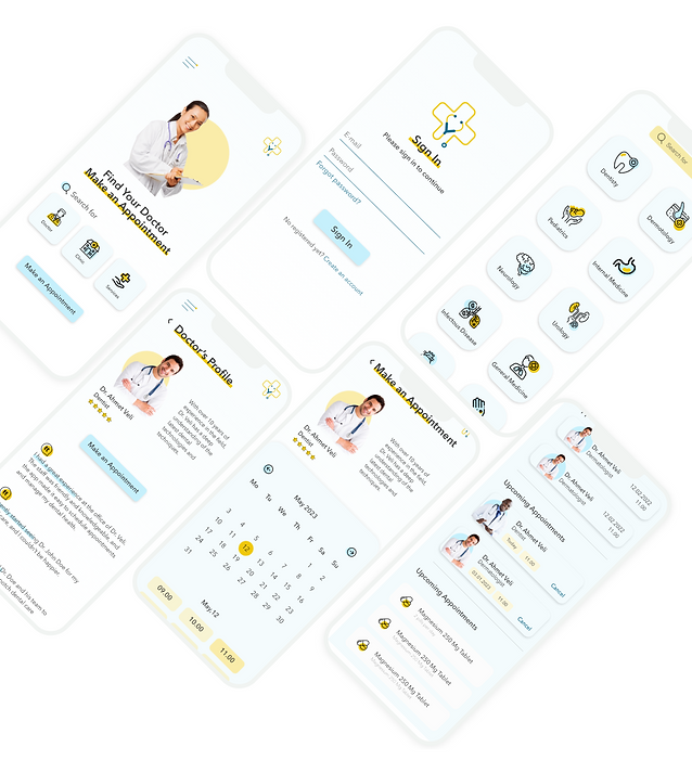
This UX design case study focuses on creating a seamless and user-friendly experience for patients looking to book doctor appointments through a healthcare app.
The Problem
This UX design case study focuses on creating a seamless and user-friendly experience for patients looking to book doctor appointments through a healthcare app.
Responsibilities
Conducting interviews, paper and digital wireframing, low and high-fidelity prototyping, conducting usability studies, accounting for accessibility, iterating on designs and responsive design.
The Goal
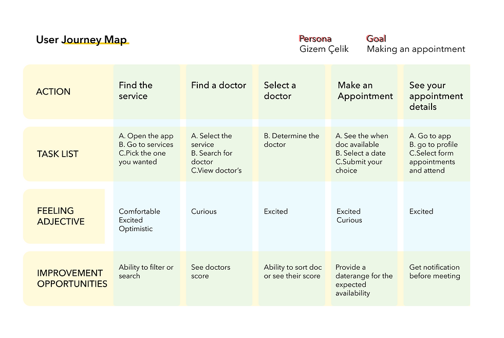
The goal of the project is to simplify the appointment booking process, making it easy and convenient for users to find and schedule appointments with the right doctor at a time that works best for them.
User Research
Pain Points
Lack of accessibility and user-friendliness in electronic health records (EHR) systems, causing frustration and decreased productivity for healthcare providers.
Inefficient and confusing navigation within healthcare apps and websites, leading to poor user experience and hindering patient engagement.
Inconsistent and incomplete information in patient health records, resulting in miscommunication and errors in patient care.
3
2
1


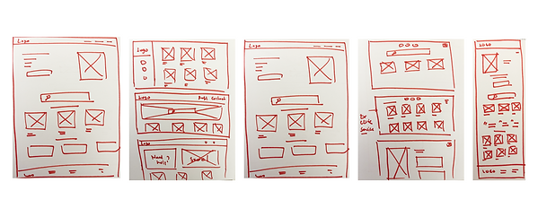
Paper Wireframes


Findings
Usability Study
Study type:
Unmoderated usability study
Location:
Turkey, remote
Participants:
3 participants
Length:
10 minutes
1. Search functionality: The study could find that users are unable to find the doctor they are looking for due to a lack of search filters or inaccurate search results.
2. Appointment scheduling: The study could uncover challenges with the appointment scheduling process, such as a lack of available appointment times or difficulties in choosing the correct appointment type.
3. Doctor information: The study could reveal that users are not able to find sufficient information about the doctors, such as their qualifications, specialties, and patient reviews.


Accessibility considerations
I used headings with different sized text for clear visual hierarchy.
I used landmarks to help users navigate the site.
I designed the site with alt text available on each page for smooth screen reader access.
3
2
1
Next Steps
Conduct follow-up usability testing on the new website. Identify any additional areas of need and ideate on new features